Why “Building”? Why not “Creating” or “Designing”? Building feels like the better verb here, because although this is the first map I’ve made, it felt like I was building a house. It has foundations, structure and decoration. So the analogy stands. It also feels like a good way to explain what I did, starting from the ground up, as it were.
The progress of the world of Rengas. The world of Ringlander
Sections:
- An introduction to the world of Rengas
- Preparation and toolkit
- Research
- Foundations
- Structure
- Decoration
- Exporting and filetypes
1. An introduction to the world of Rengas
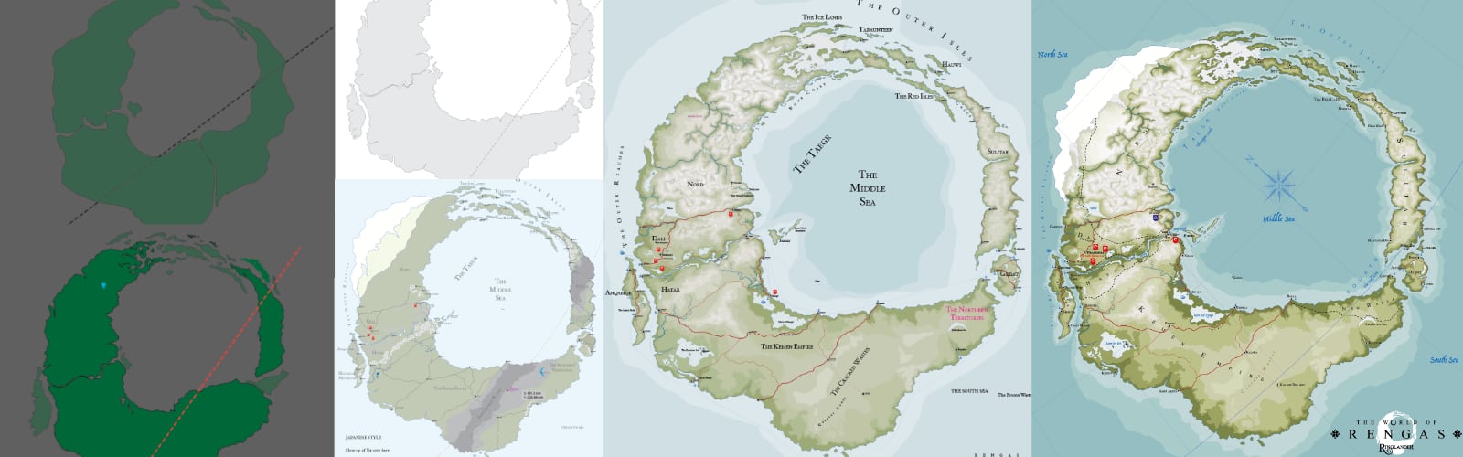
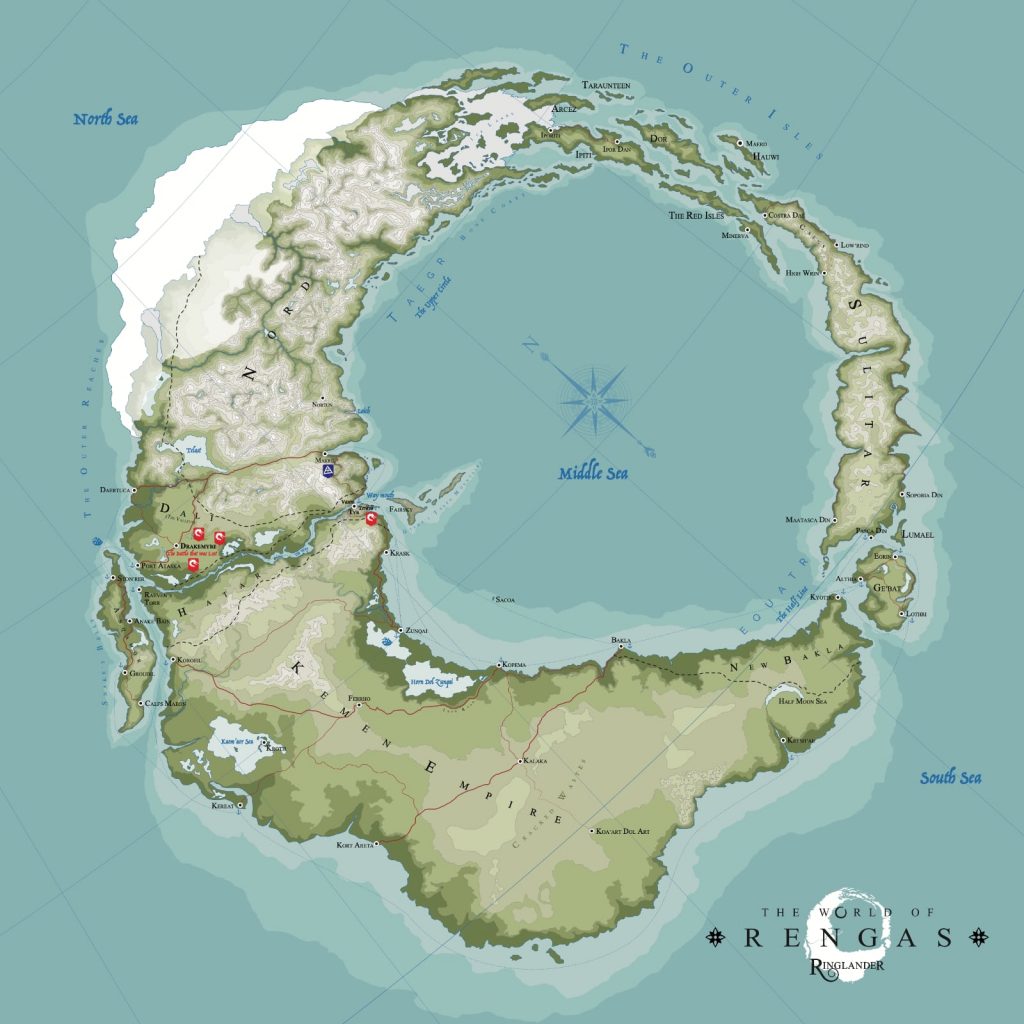
If you’ve landed here without knowledge of my book, fear not. I’ve tried to make this guide as general as possible, although I do use examples of how specifically Rengas came to be and how I built it. Either way, you can find the book here. Briefly though, I wrote my debut novel over 7 years, due to a multitude of reasons, so the details of the world I had created were able to marinate for for a long time. It helped me find a way to knit the story into the world very literally, as the main character’s heritage is to do with navigation. The main antagonists the Bohr want to conquer the lands they have yet to reach, and so maps in this world are revered and rare. Rengas is a ring-shaped fantasy world comprised of 5 main continents:
- Nord
- The Kemen Empire
- Sulitar
- The Outer Isles
- Anqamor
Join my mailing list
Be the first to know, and get exclusive offers & content, author editions and maps.
It also contains a few countries within those continents:
- Dali
- Hätär
- Ge’Bat
- New Bakla
Here’s a closer view from the same source file, which has been edited in a slightly different style. (See more below on styling a vector map)
2. Preparation and toolkit
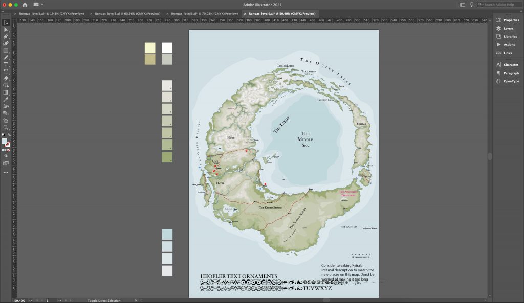
There are a number of ways you can build a map, but I’m going to talk about the way that I used which was using Adobe Illustrator. I know the program very well, so it was an easy decision for me to make, although I had never used it for something as detailed as map, with all of its coast lines and borders. One thing I was sure about was that the graphics had to be of the highest quality, as close to an actual hired map-maker might produce. I drew (literally) on my skills with graphics and design to do this, so while the tone of this post may be sort of here’s-what-I-did-next I’m not going to assume you have a full understanding of design methodologies. They do absolutely help of course, but map design, I’ve found, is a very different style of graphical art, and one that has its own unique problems and challenges.
Using Illustrator is a bit of a steeper learning curve than some of the pre-packaged map builders out there, but ultimately Illustrator gives a lot of control because it’s a vector-based design program rather than a raster-based design program.
What is the difference between vector and raster, and why is it important?
Raster image (JPG, GIF, PNG, WEBP)
When you take a photograph, the colours are encoded into very small pixels. Most, if not all, images you see on the internet taken through a standard camera are raster. Adobe Photoshop is a program that deals with editing raster images. Raster image quality is limited by resolution and do not scale up very well, but is very good for creating textured or very detailed images.
Vector image (PDF, EPS, SVG)
Vector images on the other hand are shapes created by computing distances between points and linking them up. In other words, the type of images you get when you use MSPaint. There are loads of illustration programs out there, offering different levels of control. The main benefit of vector graphics is that they are infinitely scalable. So if I wanted a crisply printed map printed in the front of my novel I can do that with a vector map, but then if I decided I’d like to print it bigger or zoom right into a particular section of the map (for example, where the story takes place) then I can do that too, and when I print it will still be crisp and clean. Or maybe, just maybe, I need a billboard design to show the world of Westeros at 40 feet long by 20 feet tall. Boom, vector graphics to the rescue.
Listen to an exclusive reading of his latest book in the RINGLANDER SERIES by the author of this post.
3. Research
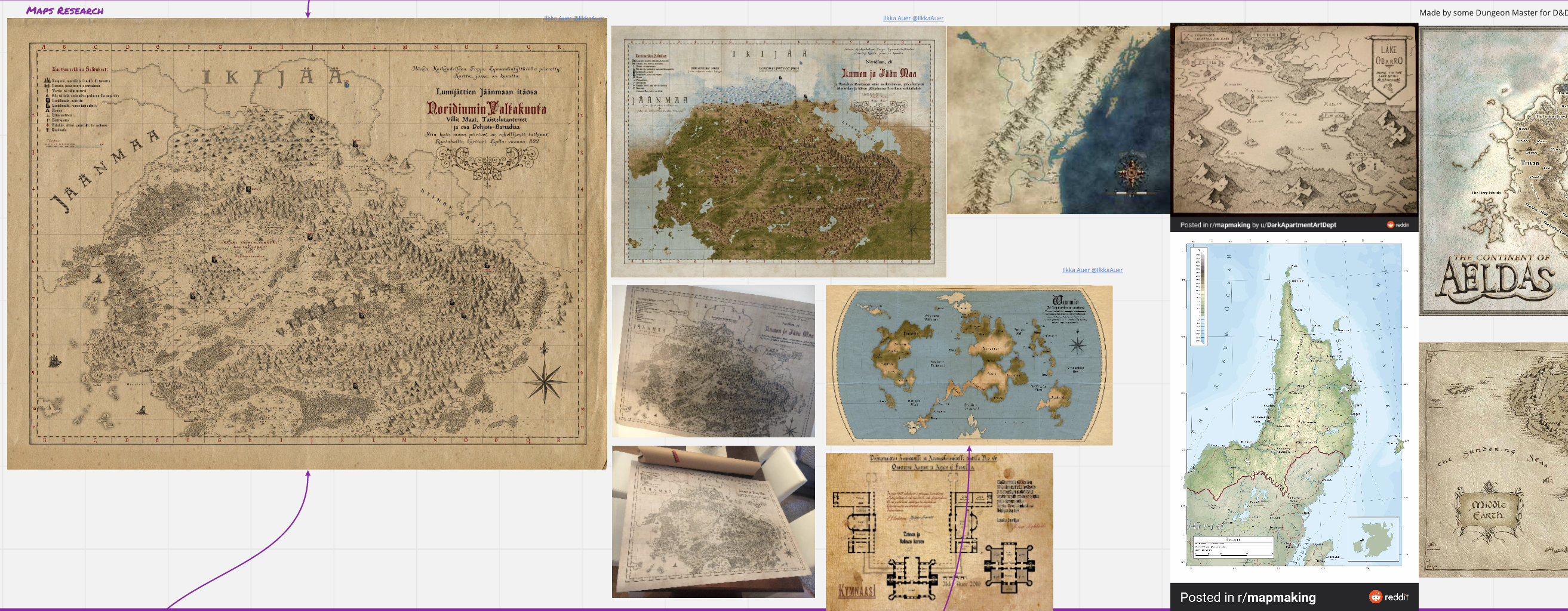
I dunno about you, (and continuing on with the house metaphor) but before I build a house I want to know what other houses look like. Luckily the internet makes this really very easy. Fantasy maps are unique in that they typically illustrate somewhere that doesn’t exist, but they still rely on the tried and tested cartographic methods employed over the years in ground surveys, ordinance surveys, atlases, terrain maps so it will not hurt to get acquainted with these varying styles of mapping a world. Researching what other writers, cartographers and map-makers have done in the past is also a good way to find out what you like. Apart from the obvious awesomeness of the Tolkien maps of Middle Earth, I loved the maps of Finnish author Ilkka Auer, which are along the same lines but far more detailed and rich. But then on the other hand I also loved the maps of Vorropohaiah (www.patreon.com/elyden). After a bit of experimenting with style I ended up much closer Vorropohiah’s maps which I thought are brighter, fresher and more interesting to look at.

The RINGLANDER SERIES is out now.
Get the THE BATTLE THAT WAS LOST.
4. Foundations
Whilst writing a scene half way through the book (The chapter Messages) I devised the term Ringlander to describe someone who was born inland. It’s an islander who says it, referring to the derogatory way the Ringlander see those from the island of Sulitar. That simple term though ended up becoming the the name of the series and helped me understand why the shape of the world was important to the story.
Epic fantasy deals with multiple countries and continents, so I was happy enough that I was building an entire world here, and the ring shape actually helped me keep things controlled so I knew that Dali was here, the Way channel was there and the distance between them was x. Handy details when writing travelogues, am I right?
Now we begin to build
Start with a shape. Mine was easy. A ring. I drew this shape on paper after I saw a stain on piece of paper. Seriously. That’s how I started. The coffee stain has such rough edges it look exactly like a coastline, so I grabbed a pencil and traced it. I open Adobe Illustrator, and dropped a photo of the tracing I had made and traced over it again in Illustrator using the Pen tool. At this point I’m using a mouse, and the quality is not very good, but I know that I have to get the shape down before I can start adding detail, so I just get on with it.
Adding detail to coastlines, mountains and lakes
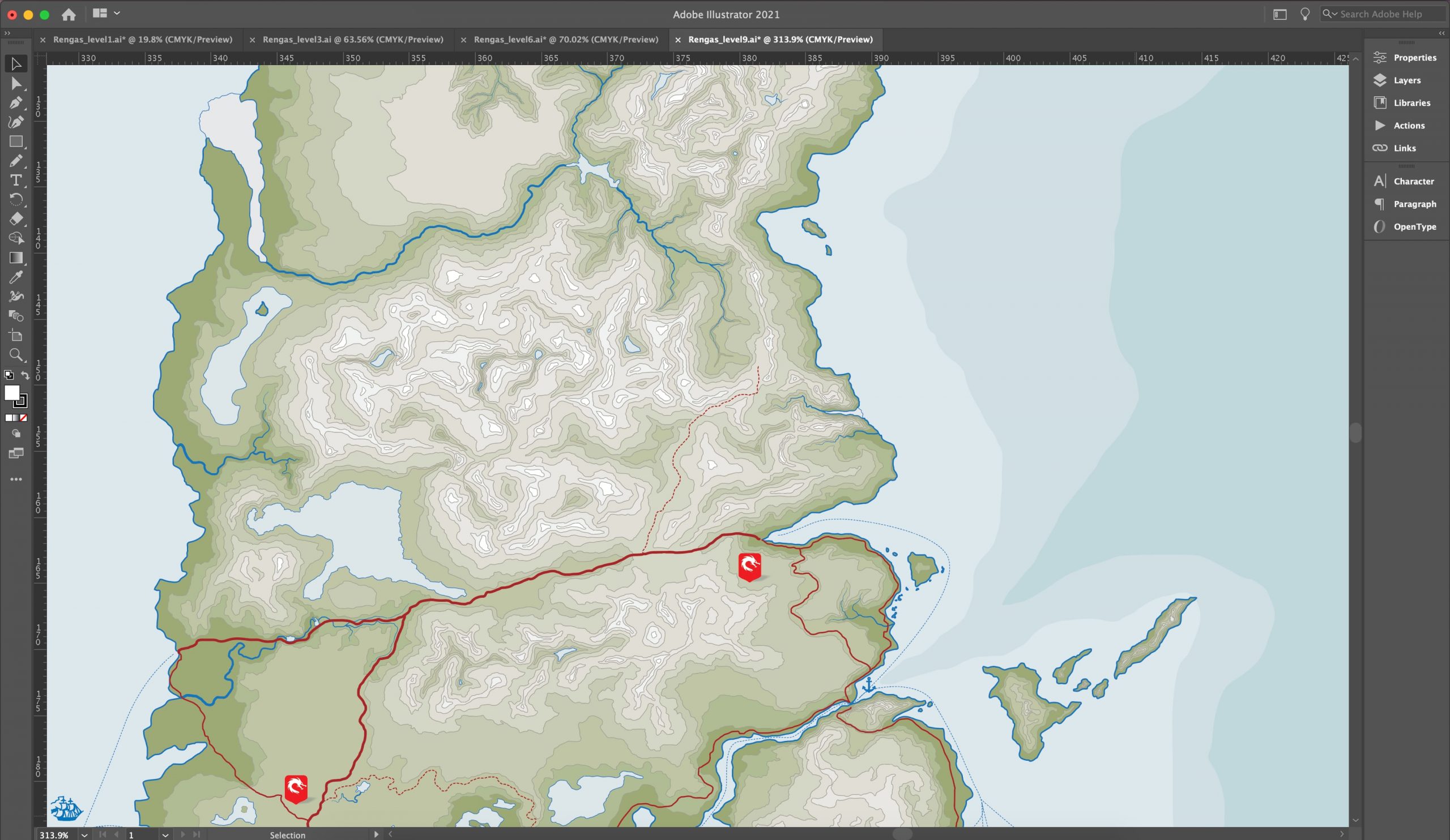
As this was a learning process I was under the impression that I would be adding detail as layers, and indeed this was how I saved the files. Starting with the filename LEVEL0 I would change the shape a little, add some coast line in and resave as LEVEL1 until over time I had 16 levels. But this was not the best way of adding detail to the map itself. I wanted my mountain range contours, coastlines and lakes to look natural and highly detailed. And whats more I wanted to have a few different zoom levels so I could show a close up of the main area the story takes place in.
Then I discovered a far easier way of adding detail to the coastlines of Rengas: using a graphics tablet to draw and then overlaying sections using the pathfinder union tool.
Method for adding detail to coastlines
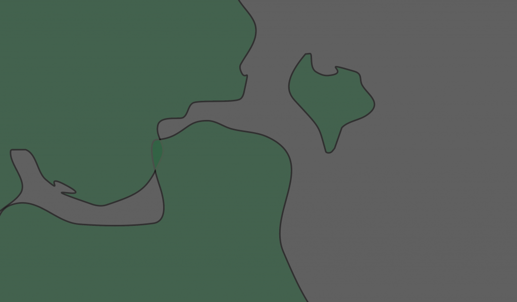
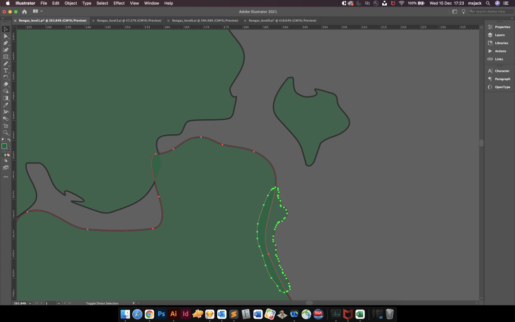
The video below by Artifexian, who describes the process in perfect detail, was recommended to me by someone on Reddit. Basically, the process involves starting with a blob shape (for an island for example) and zooming to add a higher level of detail. Then using the union tool you can merge the two shapes. When you get faster at this you can whip together a coast line in almost no time at all. Check out the video below for more detail on this process (starts at about 2:04 in)
5. Structure
How do you structure the world? LAYERS.
I hadn’t abandoned layers completely. There were so many elements in the map that layers were a useful way of separating everything out.
Sit the biggest things first, the land that stretches to the sea, then build your ground on top of it. Call this ground your Sea Level and work up to the highest peaks of you mountains ranges. This is probably a good time to start thinking about colour, or at least colour ranges.
Colour
Because this is a graphic, we have to use colour rather than stroke (lines) to build structure. In my case I used flat colour on each layer because I knew that I was going to end up with a lot of contours and decoration. These layers would fill up the space quickly so there was no need to think too hard about texturing the land, like adding tea stain or cloud-style texturing to this map. It would just look way too busy. And at the end of the day, I’m trying to show the layout of this world, not show off my graphic prowess.
So returning back to vorropohaiah‘s awesome maps, I chose a more google map style colour palette, with nice fresh minty greens for the terrain and chalky off-white blues for the sea. Think nice pastel colours here, not bold. So I went with these for a long long time while I built the world, but when I got to the end, it just didn’t feel fantasy enough. And here is where it gets geeky.
John Anthony Di Giovanni’s spectacular cover art
I dropped John’s beautiful cover art into illustrator and literally eye-dropped colours from it to generate the palette for my map. The result was much richer and saturated than I had been working with and immediately it took on a life ands style of its own. In hindsight, using the cover art was perhaps a bit unnecessary, but I had a lot of fun doing it so I thought to hell with it. I told myself I loved the synergy between cover and map, but I am almost completely sure than not a single soul who has bought the book noticed. Meh, if you like what you do yadda yadda.

Workflow and layers
If you’ve ever used Illustrator you’ll understand that just selecting shapes to work on them becomes very difficult when they overlap. At least if you have all Lakes in a layer you can lock all the other layers and when you click on the shape behind, say the terrain or the mountain range, it won’t suddenly be selected. The idea here is that you want to keep your workflow simple and quick, because building a world is a long process. Creating habits like locking layers, and colouring selection guidelines is the digital equivalent of keeping your desk tidy, so you can get on with the actual task at hand.

Rivers
Why does rivers have its own section? Because rivers are something that you must get right. We all know that rivers end up at the sea, but how do they get there? On a plan view map (bird’s eye view) rivers begin in the mountains and hill as tiny thin lines, and as they cut through the valleys and vales they join up and get thicker. When they do eventually reach the sea they are much wide river mouths.
Mountains
Originally, I had planned on going for a fully symbolised map, so mountains were ranges of actual mountain drawings, rather than contours, but with a colourised style this became harder and harder to do, and eventually I abandoned the idea in favour of something a bit more akin to an ordinance survey map. The map grew in layers but still looked very flat, so I started building up levels of terrain, which essentially amounted to drawing loads more coastlines, but inland and nested inside themselves. The colour range applied these new shapes (getting lighter as they get smaller) created the exact feel I was looking for: a dynamic looking map that showed lots of detail.
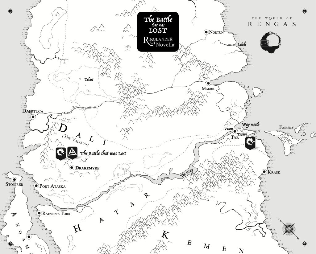
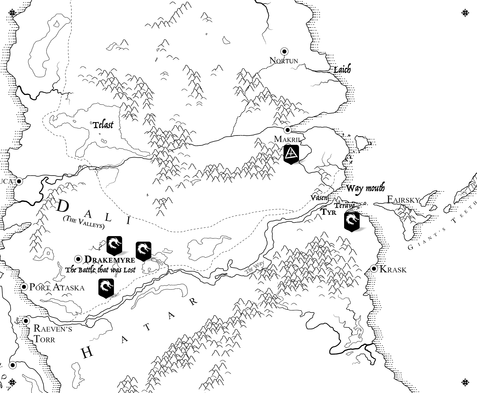
The main colourised map was coming on leaps and bounds now, but I still really loved the idea of a symbolised map. Being that I was writing a fantasy book I also wanted to include the map in the front of the book. But there was a problem Rengas is a circle, and how the hell do I spread a circle across two pages…?
You can’t. Not really. The centre of the pages will hide most of the good stuff. So, I decided to zoom into the main map and create a branched version of the map which would have no colours. This zoomed-in view would be perfect for a double spread inside the novel, and be much more printable too, being that it would be black and white. It really allowed me to explore the symbols a bit more and play with mountain ranges and some more traditional things like dashed lines for the sea. I had to scale up the fonts a bit, but this was a very easy process because I had built everything in vector shapes.
6. Decoration
Placenames and fonts
Is there anything better than searching for that font? Honestly, I spend so much time finding good fonts — time has no meaning when I’m searching through all them glyphs. Fonts are so important to all design, but in map making they are ESPECIALLY important. Why the caps? Let me explain.
In typography design and production there are many ways you can get the most out of your font, it is after all the medium upon which your written word will be read, so it makes sense to take time over it. Is the serif just right? Does it look classy enough? Does it read well at small sizes? Maybe san-serif might add more of a modern look? Or do fantasy reader always prefer serif? What about in the map itself…?
The main issue in the map, is that your country names need to define the area, and that means stretching it out over a long space. In the biz, we call this letter-spacing or kerning, or the uniform gappage between each letter. So for example, the continent that you made to be huge because it is occupied by a race of inhuman monsters (Hello KEMEN) must now be described by a single word stretched across half the page (So let’s just change it to THE KEMEN EMPIRE and all is well!)
Like “Kemen”, the shorter the word, the sillier it will look when its stretched over a large space, people expect this with maps but still you do have think about it. Then suddenly you realise that you, as God the creator in all of this madness, or the author as I like to refer to you by, gets to choose not only the shape of this continent, but the name of it too. There is a connection between the things you are designing here, so being able to make changes as you go is super important. In other words, if you are making this map yourself you can react to these subtle changes and alter the map. If you have commissioned someone to make it for you, it’s not quite so easy.
This was one of the lessons I learned as I went, that map-making is unlike any other graphical design. It is unique in that it combines typography, shape, and layer all together and that being a design-wiz is not really as helpful as you thought it might be.
Weirdly one of the reasons I settled on the fonts I used was because I could use them online. Font licensing is a minefield, but there are so many incredible fonts out there you can use for free. Check out Google fonts and you’ll find something, and best of all if you go as far as making a website for your book, you can use the fonts from your map and book cover on the site itself without paying a penny.
Ornaments
You’ve settled on a font, but it still doesn’t feel like a map. Open an ordinance survey map your father in law left behind and you soon realise why. Maps are not just about lettering and names. They also have an abundance of neatly designed, custom icons and symbols spread throughout. And they are absolutely not arbitrary. In fact nothing on this map should be arbitrary, everything should be designed and placed just so, and have a clear reason for being there. With the amount of names I was using in Ringlander I decided it might be cool to show where the armies were actually stationed. This led to the design of the icons themselves that described the armies and then including those descriptions in the book itself as vigils — something I had neglected to do. This helped enrich the book, but also was shown on the map and the two were linked nicely together. I took it a step further and used the icons in artwork too, to show which the side the characters were fighting for. I added shipping lines, port icons and even little ship icons to show there where there might be an armada (not Spanish though) hiding. All to enrich the world and make it feel more real.
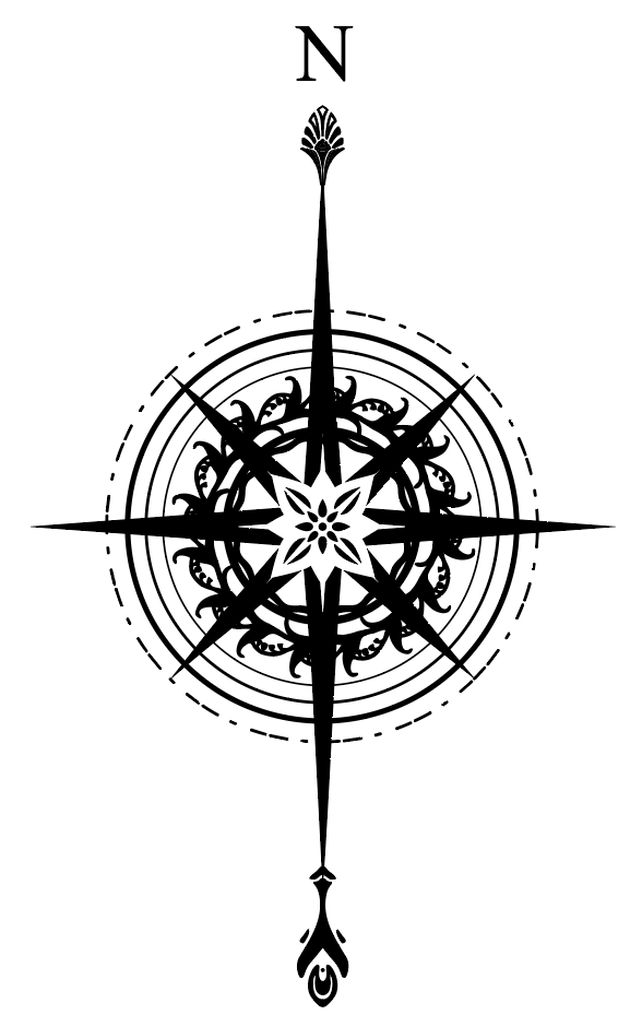
A Compass
Every map needs a compass, and every fantasy map need a cool compass. Rather than just take any old compass vector from awesomefonts or vectorstock I took some pieces of ornaments I had kicking about in an old stock folder and combined them into something new. Circular designs are very easy to make interesting. Last of all I added the N, S, E, W and took a step back and admired it. Too busy. I removed the S, E, W, and boom. We’re done. Now where to put the thing.
I also found a lovely 4-leaf flower, and as there was a festival in my book (The Feast of Moons — a kind of spring festival based on the Japanese Hanami) I used the flower to signify that. Just a nod, and one that not many would notice, but a nice little touch.
7. Exporting and filetypes
This section is kind of boring, but very important. You have now created a vector world. You can export it as a few different filetypes depending on what you need it for. Watch out, I’m gunna get specific.
Export filetypes
- Printing – PDF/EPS (any printing at all)
- Twitter/Instagram/Facebook – PNG/JPG (most social media outlets have their own compression techniques)
- Mailers – JPG (to keep sizes small)
Importing vector filetypes into Illustrator
- SVG
- EPS
There be no raster here. Use only vector formats for illustrator. Check the accordion further up the page for info on raster and vector formats.
And that’s it!
It took me a long time to make Rengas because I was learning as I went, and because I could only work in the evenings. The biggest savings in time came from watching the youtube video above though, and I wish I started like that from the beginning, with a blob shape and straight into high detail. In hindsight there were many changes that came throughout that I might not have discovered otherwise. Like the islands of Anqamor and Ge’Bat which were very different shapes originally.
If you’re making a map yourself, please let me know in the comments below, I’m happy to advise and comment on everything from style to colour and shapes to technical issues within Illustrator. Thanks!
You can buy Ringlander: The Path and the Way from my shop.
Join my mailing list
Be the first to know, and get exclusive offers & content, author editions and maps.
Hi Michael,
I recently started making fantasy maps using Illustrator and your Rengas map tutorial was very useful. I’m still getting used to Illustrator, and I have a question regarding how you made your mountains in the b&w version of the map. They look they they were made from a few assets that you then placed onto the map. I’ve tried to make a few mountains and hills and but they don’t overlap well like yours when I used a scatter brush, may I ask how you got yours to look the way it does?
Thank you,
Jim T.
Hi Jim,
Thanks for getting in touch. So the mountains were painful for the exact reason you mentioned, however, the principle is pretty basic. And just for fun we bump into a problem with vector design. Loops.
To fill a vector object, it has to have a complete loop, so a single outside perimeter. However, if you want the mountains to blend in with the ground, then you have to make the ground the same colour as the map, white, in my case. So I first drew the mountain with a pencil, played with the style of the stroke a bit, and then the important bit, I created outlines from the stroke. This changes it from a stroke to a vector object. Then we can use pathfinder to cut the bottom off the new shaped outline so our mountain is now an upside down V shape and also filled with a colour. It’s a pretty manual way of doing it tbh, but I found it gave me the most control over the style of the mountain and other ornaments, which was crucial to style of the map.
I created a handful of slightly different mountains as assets, then began placing and duplicating them on the map. I found it easier to do it by hand as it gave more control. When you paste, it naturally layers the new copy on top of the original, which is perfect for placing multiple objects. The library asset part is important too, because if you ever want to change it, you can change, for example, “Mountain A” once and it changes every instance of that mountain on the map (I had at least 100 of each mountain). Then maybe “Mountain B” needs a tweak too because you can still see the mountains behind it…And so forth.
Hope that helps!
Hey Michael,
Awesome tutorial thank you. I’m just wondering how you got such natural shapes for your mountains? They look fantastic. Is there a trick/reference you use?
Hey Oli, mostly just studying Google maps in terrain mode and also ordnance survey map of Scotland. I really wanted it to feel like there were ridges between bigger hills and then valleys too for low areas.
Then it was just a case of drawing them with a graphics tablet, which made it much quicker btw. Highly recommended to pick up one of those. Wacom was the make I used and it cost about 70 quid 8 years ago. But I guess you might be able to do it with an iPad too if you can export as vector somehow.
Hi there, I think your map is very nicely done. I have only just started doing maps using Affinity Designer, same methods different application.
Your guide was very nicely done, and I only hope I can get mine to look as good as yours on my first map too!
Hey, thanks Matt! Affinity seems cool, and I’m sure the same concepts I discuss here are relevant there. Good luck, and please get in touch if you need any help.
Michael, how did you create the engraved coastline effect in the monotone map? Thanks in advance for any advice. Cheers.
I studied some old maps and saw that they had this very particular pen style. Almost like a psuedo drop-shadow. I literally just copied it and duplicated it around the map coastline. Took a bit of time mind you! Worth it though. They all have to point the same direction for best effect, but extending out from the centre. So do one side first then mirror the line shape and start on the other side.
To be fair, there’s probably a much faster way to do it. Like aligning to a curve or path or something. But I got really bored of searching for it, so just did it by hand.